Let’s be honest—when you see that bold red DQ logo, your mouth probably starts watering a little. Whether it’s the thought of a chocolate-dipped cone, a chicken strip basket, or that magical moment when the Blizzard gets flipped upside down before being handed to you, Dairy Queen knows how to deliver joy in a cup, cone, or basket.
But here’s something you might’ve missed while sipping your shake: that logo you’ve seen on signs, cups, and napkins for decades? It actually has a hidden meaning. Yep, the Dairy Queen logo is more than just pretty branding—it’s a visual story of the company’s past, its evolution, and the full menu of flavors it represents.
From Joliet to Nationwide: Where It All Began
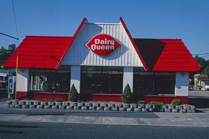
The story kicks off in 1940 in Joliet, Illinois. That’s where the very first Dairy Queen opened its doors, serving nothing but soft serve. And we mean just soft serve. Think simple cones, shakes, sundaes—no burgers, no baskets, just cold, creamy treats.
As time passed, DQ’s menu expanded fast. Banana splits, sundaes, and Dilly Bars started showing up. Then came the big shift in 1957: hot food entered the scene. Suddenly, you could grab a burger and fries alongside your cone. That move changed everything—and so did the logo.
Video: Dairy Queen Logo/Commercial History
The Early Look: Plain, Blue, and To the Point
Back in the ‘50s, the logo was all business. White, bold lettering on a blue background that simply said “Dairy Queen.” It wasn’t trying to be flashy—just friendly and functional. But that was about to change.
By the 1960s, DQ needed something with more personality. So they introduced a new design: the red ellipse. You might recognize it as the start of the now-famous lip-like shape. That bold red background with white letters didn’t just pop—it started speaking to customers in a new way.
The Red Shape: A Sweet Smile or a Secret Set of Lips?
Ever noticed how the DQ logo looks kind of like a pair of smiling lips? That’s not an accident. That signature red shape introduced in the ‘60s was meant to evoke a playful, friendly vibe. Some see it as lips. Others as a smile. Either way, it gave the brand warmth and made it feel a little more personal—less factory, more fun.
And that’s exactly what the company was aiming for. The message was subtle but effective: this isn’t just fast food. This is happiness, served warm—or cold.
DQ Takes Over: The Logo Gets Short and Sweet
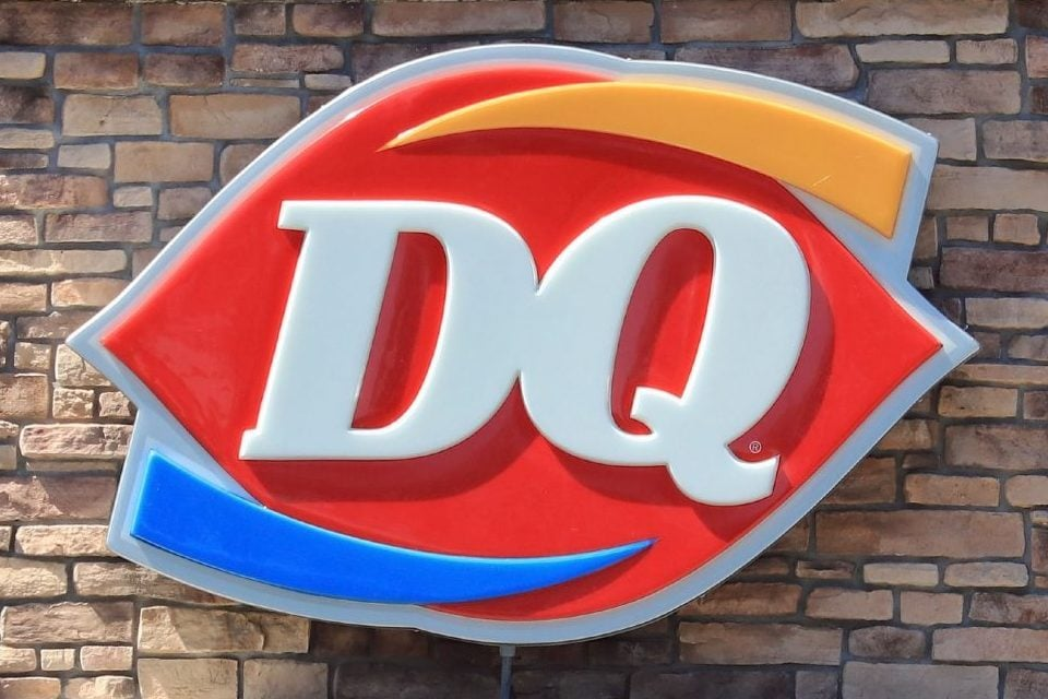
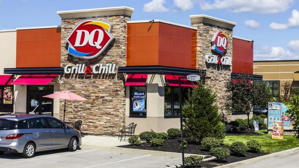
By the time the early 2000s rolled around, people had started calling Dairy Queen simply “DQ.” It was catchier, easier to say, and looked sharper on signage. So in 2001, the company rolled with it and dropped the full name from the logo. The red ellipse stayed, but now it just featured two bold, white letters: DQ.
But they weren’t done yet.
The 2007 Logo Makeover: Adding Meaning with Color
Video: Dairy Queen Logo History
In 2007, the DQ logo got a modern refresh—one that most people didn’t think twice about. But look a little closer, and there’s more going on than you’d expect.
Two swooping lines were added, one orange and one blue. They wrap around the DQ letters like racing stripes. Stylish? Yes. Decorative? Definitely. But here’s the twist—they also mean something.
The orange line represents hot food. Think burgers, fries, and chicken strips. The blue line stands for cold food—everything from Blizzards to sundaes and cones. Together, they tell a complete story: DQ isn’t just dessert anymore. It’s a full meal stop.
So next time you’re biting into a chili cheese dog or sipping on a dipped cone, you’ll know those colored lines on the logo are giving you a sneak peek at both.
It’s More Than Branding—It’s Culture
The DQ logo doesn’t just represent a business—it represents a feeling. Especially in small towns, the red oval has become a sign of comfort, consistency, and sweet summer memories.
Whether it’s a quick stop after a little league game, a Saturday lunch treat, or a nostalgic road trip indulgence, DQ brings back something more than flavor. It brings back the feeling of being a kid again, even if you’re rolling through the drive-thru in a suit.
And that’s the power of a well-designed logo. It doesn’t just sell. It connects.
Conclusion: DQ’s Logo Is a Story Served With a Smile
So, the next time you pass by a Dairy Queen or scroll through your food delivery app, don’t overlook that little red shape with the tilted white letters. Behind that simple design is a decades-long story of growth, flavor, and fun.
From its humble beginnings in Illinois to becoming a nationwide symbol of smiles, Dairy Queen’s logo has done more than just evolve—it’s adapted, communicated, and reflected the brand’s values every step of the way.
Now you know: those lips aren’t just for looks. And those lines? They’re telling a tale of hot and cold delights, all wrapped into one sweet, sizzling legacy.


